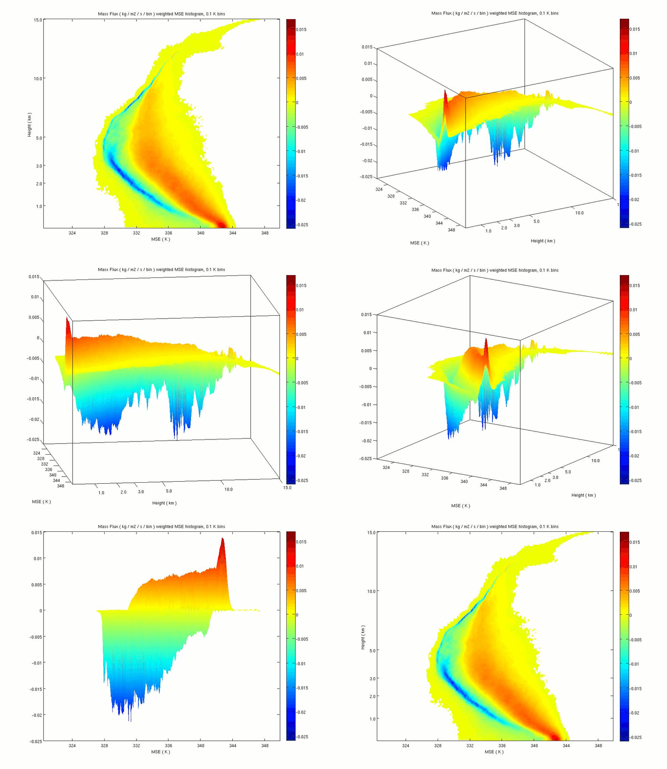
After a short hour meeting this afternoon Steve had an interesting idea about measuring the validity of entrainment rate assumptions (plenty of notes, more to come) and I have a better understanding of a method used in Kuang and Bretherton 2006 (KB06). It came up that the moist static energy (MSE) histograms I have made after KB06 are actually 3D so I thought I'd see if it's easy to make a gif out of different angles using matlab and the free software GIMP, and it was easy!
Do you see color as depth? In the plot below, the colors represent the value of the mass flux occurring at all grid points in the Giga-LES simulation that have a particular MSE at a particular height. The animation below first rotates so you can see that the updraft mass flux (red) has a maximum at low levels, and the downdraft mass flux (blue) is strongest near 3 and 8 km. A further rotation shows another angle, illustrating that the updraft mass flux is occurring for higher values of MSE compared to the downdraft.
The below is a snapshot at 12 hours into the 24 hour simulation, representing the entirety of the mass flux in the volume, over an area almost 42 billion square meters in size filled with hundreds of thousands of simulated clouds.
All of these views can be seen in the original orientation if you can see the depth of color!
Showing posts with label research. Show all posts
Tuesday, February 7, 2012
Spectrum of Entrainment Rates
For some reason that last post really made the idea of the spectrum of entrainment rates make sense for me. In the bottom figure of the last post, we considered why the calculated green curve parcel profile didn't make sense, and drew an example of a curve that would make sense using green arrows. Just to fill that idea in, consider the following drawing, illustrating that many possible "green arrow" paths are possible. Could simulating a distribution of them improve the model? What would determine the proper distribution of the field?
What I'm wondering about now is how to handle the fact that there appears to be a problem of non-uniqueness...
Monday, February 6, 2012
Constant Entrainment Rate Assumption Limitations
I think I've figured out why none of the Relaxed Arakawa-Schubert (RAS) method calculations for the cloud work function (CWF) were valid at mid-levels for the Giga-LES!
Let's start by taking a look at Fig. 8 from Lin and Arakawa 1997. At the bottom of the plot, near MSE value of 339 K, several lines emanate from a common point. This is the "plume base" which we can think of as the point near the surface where a parcel could begin to rise and follow different paths (the lines) depending on how much it mixes with the environment. These lines travel nearly straight up, but are a little bent, and some more spread to the left than others. These represent the MSE of cloud plumes with different rates of entrainment of environmental air. The MSE of the environmental air is the solid line that bulges out far to the left, and the dashed line (hard to notice except at the bottom right of the graph) is the environment's saturation MSE. It is the MSE the environment would have if it had extra moisture so its relative humidity would be 100% given its temperature. Note the cloud lines are all greater than this environment saturation MSE, hereafter MSE*. (At least this is true a little bit above cloud base the level of free convection LFC.) So that's why they are clouds.
Now take a look at my figure made today showing basically the same thing: two black lines for the environment average MSE and MSE*, as well as 4 different colored lines representing different parcel paths ending at different levels on the MSE* curve. Each colored curve represents a parcel entraining a constant amount of environmental air as it rises, that's why the MSE value is reduced from the starting value. Each curve ends at a different height as it touches the MSE* curve. Look at the top of the orange/yellowish line: if it were to continue on any farther to the left of the MSE* curve, this would make it negatively buoyant and unsaturated and would cease to be a cloud. That's why cloud top is assumed to be the NBL.
Now let us consider the green curve for a moment. It rises to the left of MSE* the entire time! This means a parcel following that path (entraining the specified constant amount with height) would always be negatively buoyant. Then it must not be a cloud at all, but a kind of mathematical fiction. The figure seems to imply that it is possible to have a cloud all through the atmosphere if it intends to stop at the top of the atmosphere, but impossible to have a cloud through to the mid-levels if it intends to stop at a mid-level. Does this mean the atmosphere is so unstable to convection there just couldn't be a cloud with a cloud top at mid-levels? No, it is an illustration of the limitations of a starting assumption. To understand why, take a look at this annotated version of the previous figure.
First look at the purple arrows. The top purple arrow points to the value of MSE* that the green curve plume is "aiming" for. Note that at this mid-level it is almost the minimum of MSE*. The purple arrow pointing down and the lower horizontal purple arrow show where the environment has the same value of MSE. Now consider the black arrows numbered 1 through 3. If the green curve were representing a parcel that was not mixing with the environment, it would rise straight up, not curve to the left. Black arrow 1 represents the "move to the left" the parcel MSE experiences by mixing with the environment value of MSE that the arrow is pointing to. We see that as we go up to arrow 2, the environment MSE continues to reduce, and mixing with it further reduces the MSE value of the green curve. However, the environment MSE is still greater than the MSE* at the mid-level cloud top we considered with purple arrows. It is not until the level of the bottom purple arrow that the parcel can even begin to mix with air with an MSE lower than the value it is aiming for. As illustrated by black arrow 3, this mixing allows the parcel's average MSE to fall to the MSE* it was aiming for.
Because we assumed a constant rate of entrainment with height, the parcel appears negatively buoyant throughout the path. As you may have already figured out, the way to get the green curve from the starting point to its ending point but have it be greater than MSE* for at least some of the path is to have it mix very little at first (rise more straight up than to the left) and then mix very much at higher levels and quickly move to the left, as illustrated by the green arrows. An entrainment rate starting very small and increasing exponentially with height would accomplish this. Indeed, an exponential entrainment rate is the solution to the entrainment relation laid out in Arakawa Schubert 1974. The RAS scheme makes the assumption that the entrainment rate is linear to reduce computational complexity.
Here we have shown that for the Giga-LES (GATE) case, a non-linear entrainment rate assumption can be critically necessary for properly simulating low and mid-level convective plumes.
Thursday, February 2, 2012
Entrainment rate calculation
Here I've tried to make a graphical representation of the way lamda is being calculated in the RAS scheme.
At the ith level, consider the value of h*(i) the saturation moist static energy (MSE). Were a parcel with MSE at the surface, h(sfc), to rise undiluted to the ith level, it would have (h(sfc)-h*(i)) buoyancy (marked with a sharp squiggly line).
For "j" from the surface up to the ith level, the value h*(i) - h(j) is summed up, represented by the crosshatched areas on the graph. Curiously to me, the area in the lower right is actually negative area because of the direction of subtraction. This means that where h(j) is in excess of the h* at the level of interest, where a parcel rising undiluted from j to i would have positive buoyancy, is being counted as negative. Then the positive area in the upper left is found. The total area is summed and the ratio between the [h(sfc) - h*(i)] buoyancy (marked with a sharp squiggly line) and that total area is the entrainment rate (also multiplying by a factor representing the distance between i and the surface).
This is like considering a level and looking down, saying to yourself, "Well, if a parcel came up here from the surface it would have this much buoyancy if it didn't entrain any air at all." But say it entrained some h from each level j on its way up here. If the net sum is small, the ratio of the max buoyancy to the net area is large and we're saying the environment is so favorable to convection that our parcel could entrain such an amount and still make it to this level just as it loses buoyancy. If, however, the net sum of the areas is getting smaller and smaller as higher and higher up level i's are being considered, the entrainment rate is getting larger and larger, until the net sum of the areas crosses zero and becomes just as small but negative, then the entrainment rate is large and negative, which doesn't make sense.
Why must the calculation be done this way? Steve has already told me there are other ways... hmm... more to come.
For "j" from the surface up to the ith level, the value h*(i) - h(j) is summed up, represented by the crosshatched areas on the graph. Curiously to me, the area in the lower right is actually negative area because of the direction of subtraction. This means that where h(j) is in excess of the h* at the level of interest, where a parcel rising undiluted from j to i would have positive buoyancy, is being counted as negative. Then the positive area in the upper left is found. The total area is summed and the ratio between the [h(sfc) - h*(i)] buoyancy (marked with a sharp squiggly line) and that total area is the entrainment rate (also multiplying by a factor representing the distance between i and the surface).
This is like considering a level and looking down, saying to yourself, "Well, if a parcel came up here from the surface it would have this much buoyancy if it didn't entrain any air at all." But say it entrained some h from each level j on its way up here. If the net sum is small, the ratio of the max buoyancy to the net area is large and we're saying the environment is so favorable to convection that our parcel could entrain such an amount and still make it to this level just as it loses buoyancy. If, however, the net sum of the areas is getting smaller and smaller as higher and higher up level i's are being considered, the entrainment rate is getting larger and larger, until the net sum of the areas crosses zero and becomes just as small but negative, then the entrainment rate is large and negative, which doesn't make sense.
Why must the calculation be done this way? Steve has already told me there are other ways... hmm... more to come.
Wednesday, February 1, 2012
Evening, Feb. 1
I've been working on understanding fortran code that Steve wrote to calculate the cloud work function and associated minimum entrainment rates after Moorthi and Suarez 1992. After perhaps 3 days of work, I have it working in Matlab in a very generalized way so that changing just a few variables in one place will consistently work through the rest of the code. GIGA-LES profiles are automatically read in from the stats file for any choice of times, a variable number of layers at the bottom of the profile can be averaged together to represent an idealized mixed layer, etc. I was able to reduce the loop run time from 20 seconds per loop down to about 0.25 s, so I can see the results of changing a few parameters over the 290 time loops in seconds instead of more than an hour.
However... what has this gotten me? Curious figures with mysterious gaps... what do they represent, how can they help answer the research question? Below is a plot of the calculated normalized entrainment rate. The full matrix actually has values over the whole domain, but some are negative, and a negative entrainment rate doesn't make physical sense in the context of the RAS model. Furthermore, just to see detail in the regions, I took the base 10 log of all values before mapping to color because the highest values (which surround the blank negative regions) are enormously higher than elsewhere. The highest values immediately transition to negative values, which to me screams of a calculation error.
There are several things to see in the plot, however. First in the circled region note that at a level, over time, a larger and larger minimum entrainment rate allows a parcel to reach that height as its non-buoyancy level (NBL). This illustrates the shifting of the already unstable profiles to be more and more unstable. At about 6 hours in we see the peak that coincides with the observed transition to deep, over-shooting convection with heavy precipitation. In the square region the values are quasi-constant, illustrating that the transition to quasi-equilibrium of the cloud work function has occurred.
Yesterday Steve and I both confirmed we had thought of a physical way to consider the blank regions, his was simpler and more intuitive: Consider a valley or depression like a crater with a peak or bump in the middle. A ball rolled from the edge may travel a variable distance up to the other crater wall depending on variable forces like friction, etc. However, if passing the hill in the center of the crater, it will either make it up and over this obstacle, or roll back and settle at the foot of the hill. There could never be a ball reaching an equilibrium level on the slope of the middle hill. In the same way, if there is a "bump" in the saturation moist static energy profile, given certain initial conditions, no parcel may come to a NBL within that region, but above or below it might be possible from a calculation view. However, the sat. MSE profile really has no serious "bump" to explain the region.
Why does the blank space shrink after the transition time (marked with arrows)? This is approximately the time precipitation is evaporating in those levels. I feel very close to mastery of the code and understanding where the error is coming from. But even if I could, is it a good use of time moving forward? Will it help with understanding what it is that allows the transition to deep convection? I think it is at least worth a few more hours. Once I can confirm the code is working properly I can move forward with our Giga-LES analysis plan and decompose the changes in the CWF into parts due to cumulus and due to the large scale forcing. Depending on the timing of changes caused by each part, it may be one step closer to understanding why deep convection doesn't take off in the simulation right away.
However... what has this gotten me? Curious figures with mysterious gaps... what do they represent, how can they help answer the research question? Below is a plot of the calculated normalized entrainment rate. The full matrix actually has values over the whole domain, but some are negative, and a negative entrainment rate doesn't make physical sense in the context of the RAS model. Furthermore, just to see detail in the regions, I took the base 10 log of all values before mapping to color because the highest values (which surround the blank negative regions) are enormously higher than elsewhere. The highest values immediately transition to negative values, which to me screams of a calculation error.
There are several things to see in the plot, however. First in the circled region note that at a level, over time, a larger and larger minimum entrainment rate allows a parcel to reach that height as its non-buoyancy level (NBL). This illustrates the shifting of the already unstable profiles to be more and more unstable. At about 6 hours in we see the peak that coincides with the observed transition to deep, over-shooting convection with heavy precipitation. In the square region the values are quasi-constant, illustrating that the transition to quasi-equilibrium of the cloud work function has occurred.
Yesterday Steve and I both confirmed we had thought of a physical way to consider the blank regions, his was simpler and more intuitive: Consider a valley or depression like a crater with a peak or bump in the middle. A ball rolled from the edge may travel a variable distance up to the other crater wall depending on variable forces like friction, etc. However, if passing the hill in the center of the crater, it will either make it up and over this obstacle, or roll back and settle at the foot of the hill. There could never be a ball reaching an equilibrium level on the slope of the middle hill. In the same way, if there is a "bump" in the saturation moist static energy profile, given certain initial conditions, no parcel may come to a NBL within that region, but above or below it might be possible from a calculation view. However, the sat. MSE profile really has no serious "bump" to explain the region.
Why does the blank space shrink after the transition time (marked with arrows)? This is approximately the time precipitation is evaporating in those levels. I feel very close to mastery of the code and understanding where the error is coming from. But even if I could, is it a good use of time moving forward? Will it help with understanding what it is that allows the transition to deep convection? I think it is at least worth a few more hours. Once I can confirm the code is working properly I can move forward with our Giga-LES analysis plan and decompose the changes in the CWF into parts due to cumulus and due to the large scale forcing. Depending on the timing of changes caused by each part, it may be one step closer to understanding why deep convection doesn't take off in the simulation right away.
Subscribe to:
Posts (Atom)


